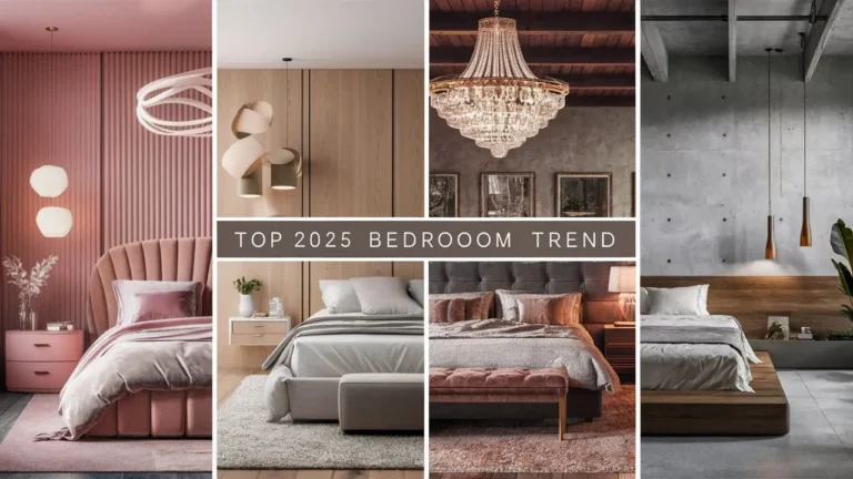

+20 Beautiful Bedroom Colour Ideas for a Calm and Restful Space
Color psychology can help you create a room where you can gently fall asleep and rest. If you’re creating a new bedroom palette or updating an existing palette, your bedroom is that one room in a house that should be designed just for you. Unlike shared spaces or commonly trafficked areas like entryways, the bedroom does provide an opportunity to indicate your style and ease your wellness through color.
As picking the right bedroom shade is about more than trends.It’s about feeling, calming, and making it a personal space. This guide has been revised as of 26 February 2024 and includes literally a curated list of 16 colours to draw inspiration from, along with trusted recommendations from other designers and stylists.
The Personal Power of Colour
Choosing a bedroom colour is a welcome exercise in self-expression. It’s also where design meets science. While your preferred colors should take priority, experts suggest using color psychology to optimize your peace and calm.
“Create a flexible palette that you can update as your – tastes change,” says Marianne Shillingford, Creative Director of Dulux. Instead of painting altogether, you can update your look through stripes, borders, or other color ways that feel current.
We have reviewed 16 lovely bedroom colors below for your inspiration, with design-based recommendations and styling notes to help you choose each of these shades.

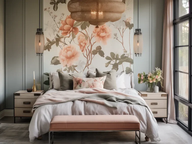
1. Blush
Blush pink is arguably a neutral and shouldn’t be limited to current trends. Blush pink is calming and balancing — a soft color choice contributing to a gentle nurturing environment. Blush pink has also been historically associated with femininity and warmth, and works similarly with soft greys or whitewashed wood. Add brass lighting or velvet throws for a grown-up twist.


2. Deep Green
Symbolising harmony and restoration, deep green brings the outside in. According to Mylands, rich greens like ‘Holbein Chamber Green’ pair beautifully with copper accessories and warm leather accents, grounding the space and creating a sense of quiet luxury.


3. Midnight Blue
This dramatic shade is said to calm a busy mind and even lower the heart rate. Midnight blue makes a powerful backdrop for natural linens or rattan textures. Try Dulux’s ‘Lost Lake’ for depth, especially behind the bed.


4. Lavender
As a pastel used less around the home, lavender has the softness of pink and the calmness of blue. It’s good for bedrooms, small or shared, but designers recommend layering it with warm neutrals and textures to soften the bubblegum sweet look.


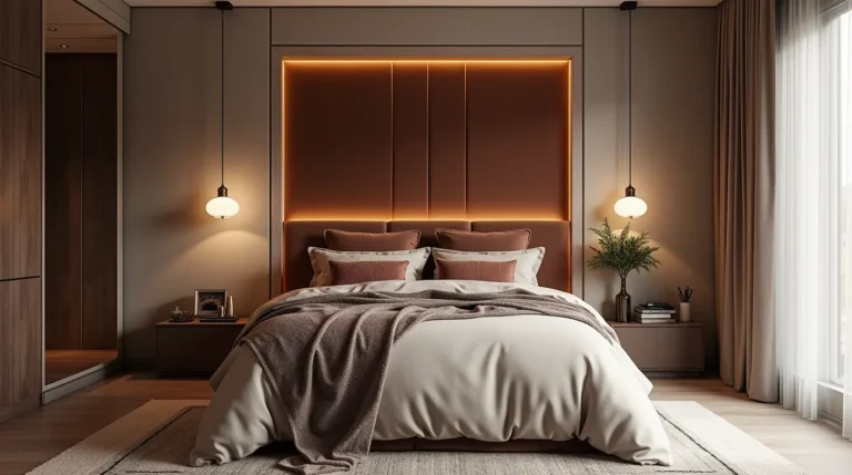
5. Terracotta
Grounding and earthy, terracotta evokes warmth and rich energy. Terracotta can be rendered on accent walls and used through textiles like cushions or bed throws. It looks fantastic with dusty pinks, ochre, or pale sage. For a real bold move, paint the ceiling too.

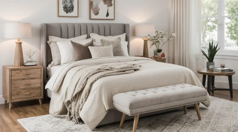
6. Soft Grey
Subtle and endlessly versatile, soft grey provides a calming canvas. Interior experts from Farrow & Ball suggest ‘Cornforth White’ as a base, layered with deep charcoal and pale taupe for dimension. Ideal for minimalists.


7. Sky Blue
Light and airy sky blue evokes summer days, and creates spaciousness and light. Pair with white plantation shutters and a natural material on the floor like sisal or seagrass for a coastal feel.


8. Moss
Mossy greens, the tones available are softer than emerald and warmer than mint, feel restorative & organic. Stylistically, moss can be paired with walnut wood with terracotta tiles to create rich, grounded palettes. Try Benjamin Moore’s ‘Backwoods’ to get the look.


9. Peach
Peach is a warm, upbeat alternative to beige; an energising colour that will lighten a bedroom without getting out of control. Style with crisp white bedding, pale gold accent pieces and house plants. Great for morning people!


10. Charcoal
Moody and modern, charcoal makes a statement while encouraging deep rest. Interior stylist Natalia of Kelling Designs recommends using it behind the bed and brightening with lighter linens and oversized art.


11. Pale Sage
Green’s gentler cousin, sage is ideal for creating a spa-like environment. Combine with clay ceramics and linen bedding. Hillarys’ Roman blinds in sage green are an elegant, subtle touch.


12. Dusky Rose
This romantic colour creates softness and elegance.Try just painting the lower third of the wall or applied to wardrobes and trim. It works particularly well with brass trims and vintage-style light fixtures.


13. Navy
Navy is a classic colour and communicates confidence. It works beautifully for both traditional and contemporary bedrooms. Layer with caramel, beige, or even coral for contrast. Farrow & Ball’s ‘Stiffkey Blue’ is a favourite and trusted paint.


14. Beige
Beige is back in fashion – and certainly not boring. Choose warmer undertones, and choose tactile materials as boucle and raw linen to avoid looking flat. Layered’s natural rugs and neutral bedlinen from Sheridan works well.


15. Teal
Teal is dynamic and bold. It injects energy into a space but won’t slice through the ambiance like a darker blue can. Use it on a feature wall or bed upholstery. Natalia offers velvet headboards in teal that instantly elevate a neutral room.


16. Greige (Grey + Beige)
The ultimate modern neutral, greige blends the best of both worlds. According to interior consultant Rachel Fowler, “It offers an optimal sleep environment while still feeling warm and contemporary.”Paint the ceiling a warm white flat ceiling paint to frame the space.


What to Read Next
Once you’ve chosen your colour, it’s time to get hands-on. Check out our guides to painting a room like a pro or explore 57 Classy Bedroom Ideas for 2025 – Elegant & Modern Styles for Every Taste for even more inspiration.
Concluion
When you think about the colour of your bedroom, a strong preference for a specific colour means very little if you have not thought through what the intended purpose of that space is—as a space for rest, which represents you and continues to evolve with you. Whether you prefer soft blush tones, mid-toned greens, or a more bold and grounding choice like navy blue or charcoal, colour gives you a different way to control sensations within your bedroom.
As you have seen, a well-considered colour palette can do more than just make your bedroom look pretty—it can change your mood, help you sleep, and support your health and wellbeing on a daily basis! Now that you have thought through some options of colour and gathered some insight from inspiring colours, you are ready to take this knowledge and turn your bedroom into your own personal oasis.
Trust in the process—try swatches in various lights and mix textures and accents to achieve a desired result. Sometimes the smallest shift in colour and position (such as a small stripe) can make the biggest difference.
Above all, design with conviction—you are the one that sleeps there, stays in the room, and may need to escape from time to time!