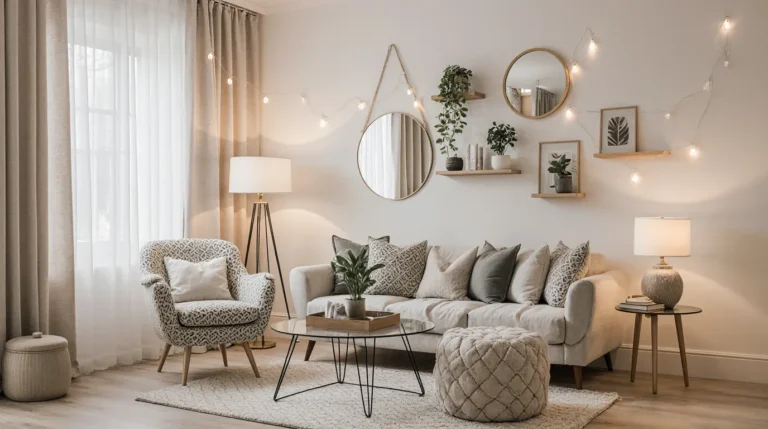
The 15 Best Living Room Paint Colors, According to Interior Designers
Change your space with comforting and stylish palettes approved by designers.
Rethinking your sitting area design incurs higher stakes than any other space in the house. It is the room we unwind after a long day, host familial get-togethers, and showcase our personal design creativity.
But choosing the perfect color? That’s often easier said than done. Even a “simple white” has countless variations, each with subtle undertones that affect the entire mood of a space . Now, consider decorating with additional lighting, furniture style, and even flooring, and the decision becomes a frantic race to the finish.
To make it easier, we turned to some of the best commercial interior designers for recommendations on the living room wall colors. They universally agreed on these 15 options ranging from soft whites and classic gray to irresistable beige and even daring blue, claiming that these colors never seem to fade with time.
01 of 15
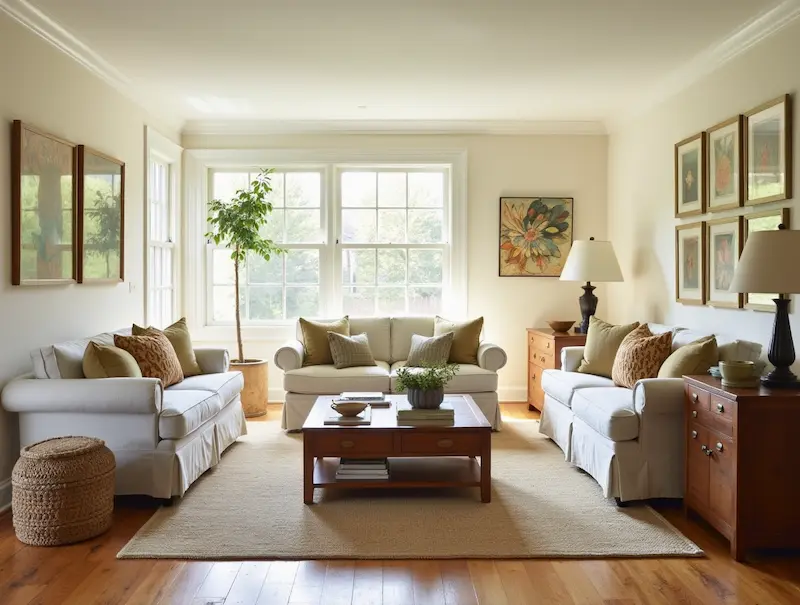
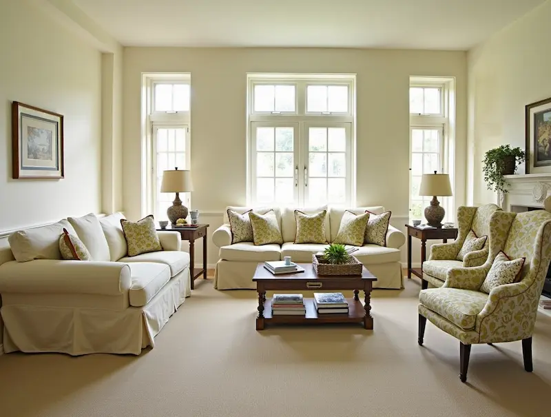
Whitehall – Mylands
This shade is best for rooms with natural and artificial light because its warmth ensures the space feels cozy and not sterile. And because it is so rich and versatile, furniture and art are able to shine. Interior designer Jet Hruby calls it “the ideal backdrop for layering.”
02 of 15
Green Smoke – Farrow & Ball
Green Smoke adds depth and a touch of drama without being overpowering. With gray-blue undertones, this shade transitions beautifully throughout the day. Designer Minette Jackson uses it “to introduce character in both modern and vintage-inspired interiors.”

03 of 15
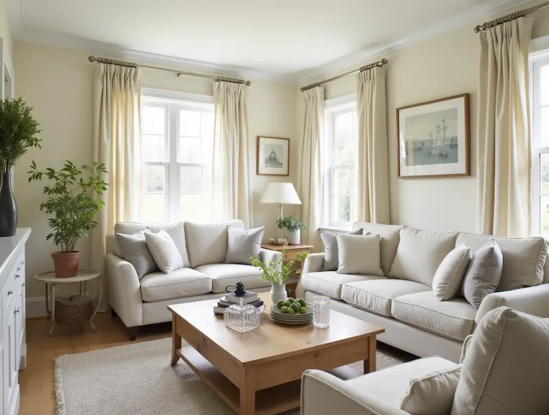
Ballet White – Benjamin Moore
Ballet White walks the line between cream and gray, offering softness without dullness. Its slightly warm tone makes it ideal for living rooms aiming for a cozy yet airy feel. “It flatters everything around it,” says Suzanne Kasler.
04 of 15
White Dove – Benjamin Moore
A classic choice that never fails. The tone of White Dove is bright and fresh, yet holds a soft cozy undertone so it does not feel cold. DeLeon has said that this color is her favorite in open spaces and adds, “It plays nicely with both cool and warm palettes.”

05 of 15
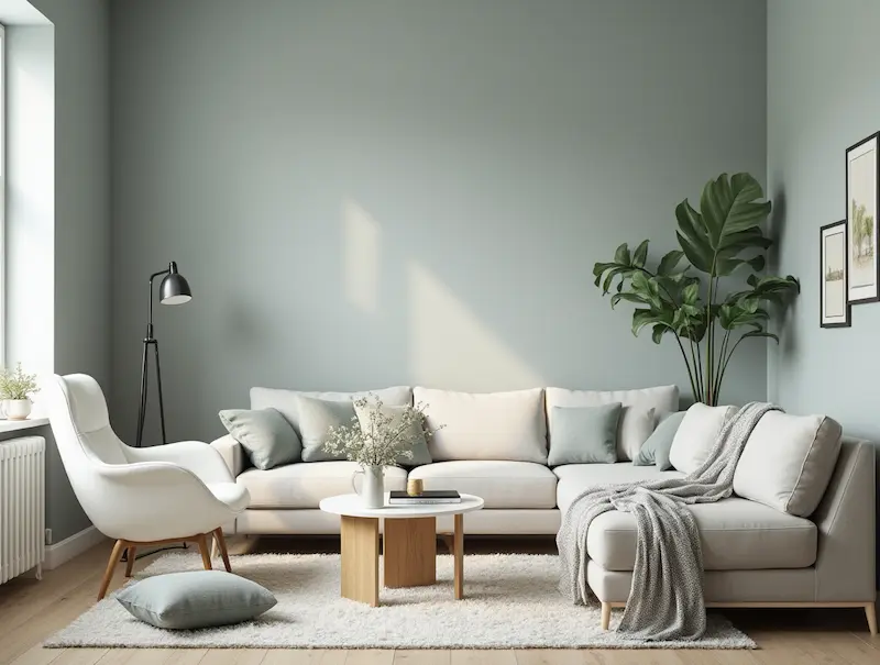
Classic Gray – Benjamin Moore
Not too cold, not too beige — Classic Gray is just right. Lara Apelian calls it her “go-to neutral” when clients want flexibility without sacrificing elegance. It pairs especially well with earth-toned accents.

06 of 15
Cotton Balls – Benjamin Moore
Softer than a stark white but brighter than ivory, Cotton Balls brings a gentle radiance to any living space. “It’s a clean slate,” says Mike Rupp, who recommends it for homes that lean toward traditional design.

07 of 15
Wickham Gray – Benjamin Moore
This pale, misty gray with blue-green undertones gives the illusion of more space — ideal for small living rooms or apartments. Jeanne Barber says, “Wickham Gray shifts subtly throughout the day, making it endlessly interesting.”
08 of 15
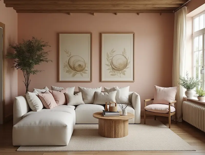
Setting Plaster – Farrow & Ball
For those drawn to earthy elegance, Setting Plaster is a sophisticated blush-toned neutral. It adds warmth without going pink. Megan Evans notes, “It’s understated, but adds that gentle, lived-in richness.”
09 of 15
Acadia White – Benjamin Moore
Acadia White’s creamy undertone makes it one of the most comforting whites available. “It softens every corner it touches,” says Juliette Byrne. This shade works well in traditional and cottage-inspired settings.
10 of 15
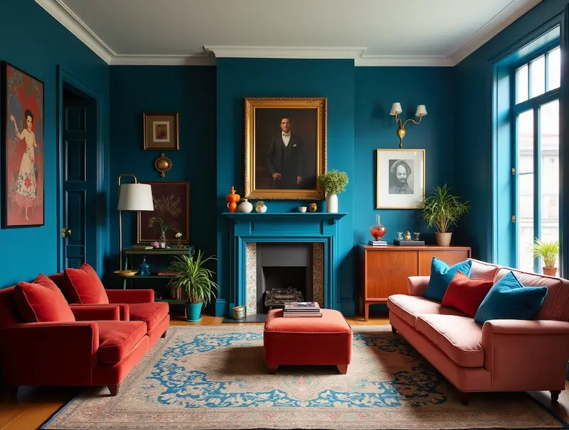
Ballroom Blue – Farrow & Ball
Looking for something bolder? Ballroom Blue is cheerful yet refined. Leigh Lincoln describes it as “a statement color that still feels timeless.” It pairs well with brass fixtures and deep wood finishes.
11 of 15
Shadow Beige – Pratt & Lambert
A beige that doesn’t feel outdated, Shadow Beige brings a sense of modern warmth to living rooms. “It has a taupe-gray undertone that adds depth,” explains Laura Fox.
12 of 15
Imperial Gray – Benjamin Moore
Gray gets a glamorous upgrade with this saturated yet subtle hue. With hints of lavender, Imperial Gray is ideal for moody, intimate spaces. Nick Cryer recommends it “for a high-end look that’s still livable.”
13 of 15
Pewter Plate – Dulux Heritage
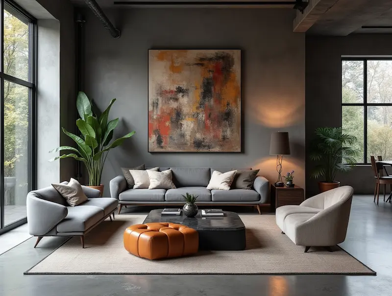
Pewter Plate is a true gray with slightly cool undertones, offering a modern, industrial edge. Christie Ward says, “Use this to anchor a room with bold art or sculptural furniture.”
14 of 15
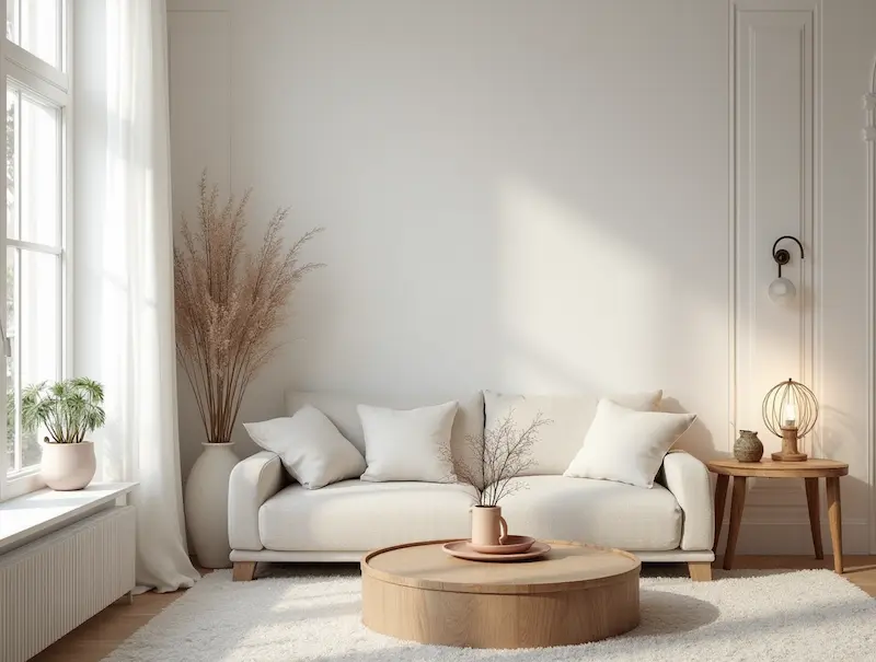
Swiss Coffee – Benjamin Moore
A cult favorite for a reason, Swiss Coffee is the chameleon of whites. Warm but not yellow, bright but not sterile — it’s ideal for both minimalist and cozy aesthetics. “It flatters every type of natural light,” notes Arianna Barone.
15 of 15
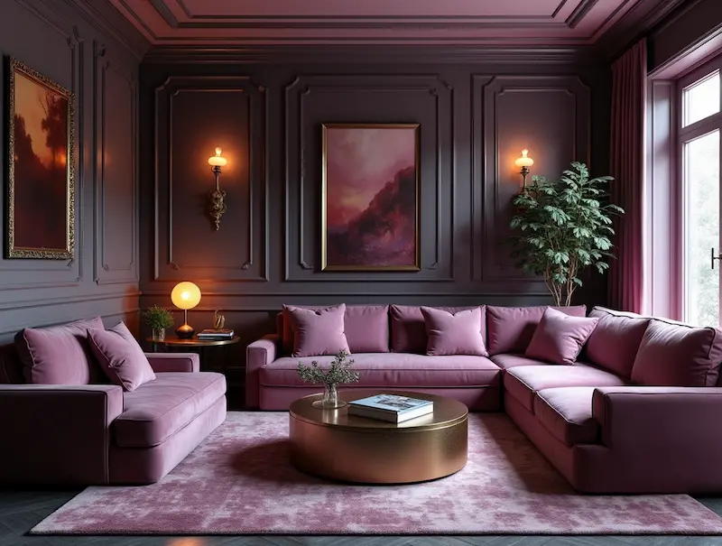
Cinnamon Slate – Benjamin Moore
Named Benjamin Moore’s Color of the Year, Cinnamon Slate is an elegant taupe with a hint of violet. It’s unexpected, grounded, and endlessly luxurious. Interior designers are embracing it as a fresh alternative to beige and gray.
Final Thoughts
You could want a bold color, a clean white, or a grounding neutral; either way, the correct paint color has the ability to transform your living room completely. The hues shared by these expert designers were chosen not merely based on current trends. Their color palettes are relied upon for style and comfort in the spaces they design.
For those still indecisive, this will help: paint is one of the cheapest, yet impactful changes you can make. Start with a sample, check it at different times of day, and consider how it interacts with your decor. Your perfect shade is out there—just waiting to bring your living room to life.